On this page
- What is legibility?
- What is readability?
- What's the difference between legibility and readability? A side-by-side view
- Readability of fonts: where legible and readable overlap
- When legibility matters more, and when readability does
- The seven key elements of typography, sorted by which quality they serve
- How to measure each
- Practical fixes that improve both
- Why the distinction matters for SEO and UX
- Conclusion
- Frequently asked questions
Legibility is how easily a reader can recognize individual letters and words; it's a property of the typeface and how it's rendered (letterforms, size, contrast, spacing). Readability is how easily a reader can understand and move through the text as a whole; it's a property of the writing (sentence length, word choice, structure) combined with the layout (line length, line spacing, hierarchy). A page can be perfectly legible and still unreadable, and a beautifully written piece can be set in a font nobody can decipher. This guide explains the difference between legibility and readability, what affects each, how to measure them, and the practical fixes that improve both on screen and in print.
Key takeaways
- Legibility is about recognizing characters: typeface design, size, weight, contrast and letter spacing. It's mostly a design decision.
- Readability is about understanding text: how long the lines of prose run, vocabulary, paragraph structure and layout. It's mostly a writing and typesetting decision.
- Legibility is a precondition for readability, not a substitute. Fix the font first, then the writing.
- Readability is measurable with formulas (Flesch Reading Ease, Flesch-Kincaid grade level); legibility is assessed with tests of recognition speed and accuracy, or simply by checking against known guidelines.
- For web content, aim for a legible 16px+ body font with good contrast and a reading level around grade 7 to 9 for a general audience.
What is legibility?
Legibility refers to how easily a reader can distinguish one letter from another and recognize what they spell. It lives at the level of the glyph, and typographers treat it as the DNA of a typeface: the characteristics built in before anyone sets a line of type. A legible typeface has letterforms that are clearly differentiated (the capital I, lowercase l and numeral 1 don't look alike; the a, e and o have open shapes that don't close up at small sizes), open counters (the enclosed spaces inside letters such as o and e), and consistent stroke thickness; heavy weights close those counters and very light weights lose them. Legibility also depends on how the type is used: font size, the contrast between text and background, letter spacing (tracking) and the rendering quality of the screen or paper.
Typeface designers talk about legibility; it's the quality they're building into the font. A decorative script face can be beautiful and nearly illegible at body size. A workhorse sans serif such as Helvetica or the system fonts on your phone is designed to be highly legible first, which is why it's boring to look at and effortless to read. Uppercase text and long runs of capital letters are less legible than lower-case letters because the word shapes flatten out; headlines get away with it, body text doesn't.
What makes a font legible?
- Typeface design: distinct letterforms, a generous x-height (the height of lower-case letters above the baseline), open apertures, moderate contrast between thick and thin strokes. Geometric sans serif typefaces with near-identical round shapes can be less legible than humanist ones at small sizes.
- Size: body text below about 14 pixels on screen, or 9pt in print, loses legibility for most adults; 16px to 18px is the modern web default, and viewing distance matters as much as size.
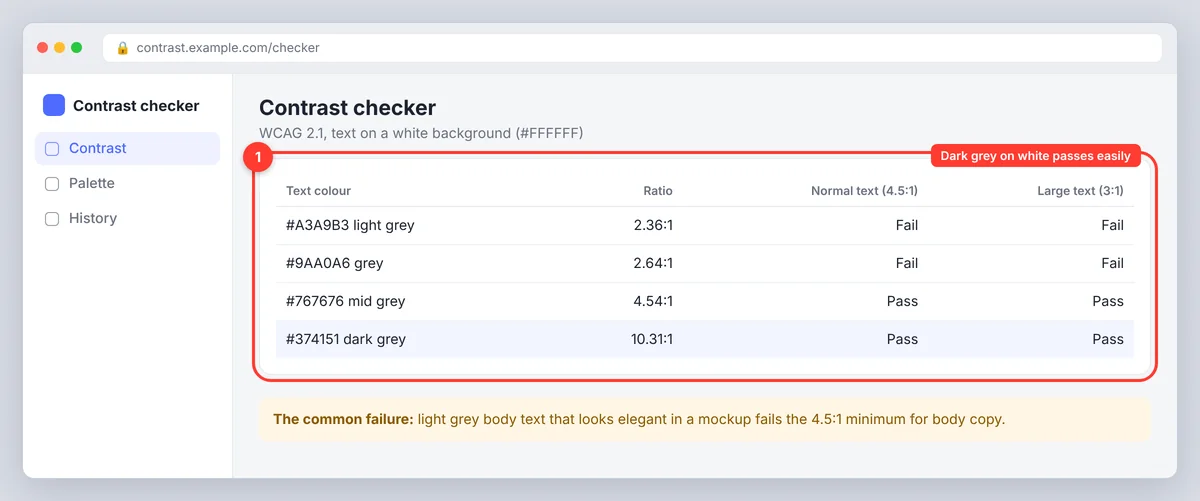
- Contrast: text and background need enough luminance difference. Light grey on white fails; the WCAG contrast guideline is a 4.5:1 ratio for body text.
- Spacing, kerning and crowding: too tight and letters merge; too loose and words fall apart. Kerning fixes individual pairs, tracking adjusts the whole word, and crowding at small sizes is the usual culprit on screens.
- Weight and style: very thin weights and long passages of italics or all caps reduce letter recognition.
- Rendering: low-resolution screens, poor hinting and small print all degrade otherwise legible type.
What is readability?
Readability is how easily a reader can process and comprehend a passage of text. It operates at the level of the sentence, the paragraph and the page. Two factors combine to produce it. The first is the writing itself: sentence length, word familiarity, syllable count, active versus passive voice, how much the reader has to hold in mind before a thought resolves. The second is the typesetting: line length (around 45 to 75 characters per line is comfortable), line spacing (leading of about 1.4 to 1.6 for body text on screen), paragraph length, headings and white space that let the eye find its place.
Readability is what readability formulas and readability checkers measure, at least on the writing side. Flesch Reading Ease scores a text from 0 to 100 using average sentence length and syllables per word; Flesch-Kincaid, Gunning Fog, SMOG and Coleman-Liau translate similar inputs into a US school grade level. They're blunt instruments (a short line of jargon scores well), but they catch the most common problem in business and web writing: prose that runs on and vocabulary with too many syllables. Essentially, readability factors are the ones a typographer can't fix alone.
What affects readability
- Sentence length: average under 20 words for general audiences; vary the rhythm so readers can skim.
- Word choice: common, concrete vocabulary over abstract or technical terms where meaning allows; keywords matter for search, clarity matters for the reader.
- Structure: one idea per paragraph, a heading every few hundred words, lists for parallel items, no unbroken block of text.
- Line length and spacing: 45 to 75 characters per line, leading of 1.4 to 1.6, paragraphs separated by space.
- Hierarchy and alignment: left-aligned ragged-right text, clear heading sizes, no justified text with rivers of white space.
- Reader knowledge: the same text is more readable to an expert than a newcomer, which is why you write for the audience you actually have.
What's the difference between legibility and readability? A side-by-side view
| Legibility | Readability | |
|---|---|---|
| Question it answers | Can I recognize these letters and words? | Can I understand and move through this text? |
| Level | Characters and word shapes | Lines, paragraphs, whole page |
| Who controls it | Type designer, then the designer choosing size, contrast and spacing | Writer and editor, then the designer setting line length, spacing and hierarchy |
| Measured by | Recognition speed and error rates in reading tests; contrast ratios; design guidelines | Readability formulas (Flesch, Flesch-Kincaid, Gunning Fog), comprehension tests, reading time |
| Typical failure | Thin grey 12px text on a white background; a decorative font for body copy | 40-word lines full of nouns; a wall of text with no headings |
| Fix | Change the font, size, weight, contrast or spacing | Shorten the prose, simplify vocabulary, add structure, fix line length and leading |
The relationship is one-directional: legibility is necessary for readability but doesn't guarantee it. If readers can't make out the letters, nothing about the prose matters. If they can, the prose and the layout decide whether they keep going.
Readability of fonts: where legible and readable overlap
People often ask about the "readability of fonts", and the honest answer is that fonts mostly affect legibility, while the way you set them affects readability. A few font-level choices do cross the line:
- Serif vs sans serif: decades of studies show no consistent difference in reading speed between serif fonts and sans serif typefaces on modern screens. Serif typefaces were once preferred for print body text and sans serif for screens because of low resolution; on today's displays, pick for tone and for legibility at your sizes, not for a readability myth. Conversely, a serif face with very fine hairlines can lose legibility on a cheap phone, so test the details.
- x-height and width: fonts with a large x-height read larger at the same point size, which lets you use slightly smaller sizes without losing legibility.
- Line length: a condensed font fits more characters per line, so it needs a narrower column or a larger size to stay within the 45 to 75 character comfort zone.
- Dyslexia-friendly and accessibility considerations: clear letterform differentiation, generous spacing and avoiding italics for long passages help everyone, not only readers with dyslexia; the evidence for special "dyslexia fonts" is weak, but the spacing advice holds.
When legibility matters more, and when readability does
Legibility dominates wherever text is glanced at rather than read: signage, buttons, labels, captions, dashboards, anything read at a distance or in a hurry. Nobody reads a stop sign as prose; they recognize it. Readability dominates in long-form text: articles, documentation, reports, emails, anything a person settles into. A legible font with poor leading and 40-word lines still loses the long-form reader. In practice you need both, but the budget shifts: spend on the typeface for interfaces and wayfinding, spend on the editing and the measure for anything over a few paragraphs.
The seven key elements of typography, sorted by which quality they serve
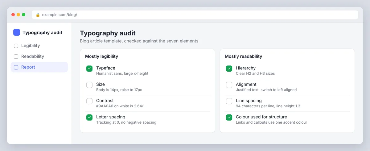
Good typography guides often list seven elements: typeface, size, hierarchy, contrast, alignment, spacing (leading, tracking, kerning) and colour. Each one contributes to one of the two concepts more than the other. Typeface, size, contrast and letter spacing mostly serve legibility. Hierarchy, alignment, line spacing and colour used for structure mostly serve readability. Keeping the two lists apart is the fastest way to diagnose a page that "feels hard to read": if the letters are hard to make out, it's the first group; if the letters are fine but the eye keeps losing its place, it's the second.
How to measure each
Measuring readability
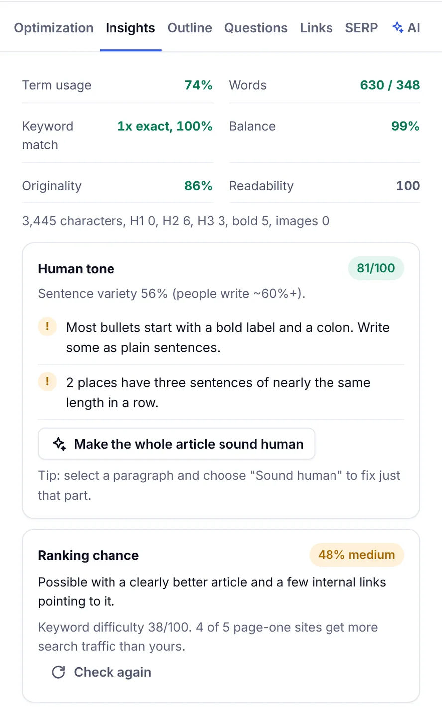
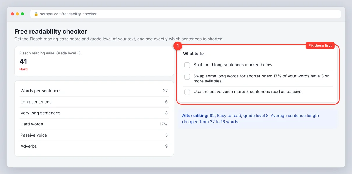
Paste the text into a readability checker to get Flesch Reading Ease, grade level, average sentence length and the proportion of long vocabulary. SerpPal's free readability checker does this in the browser and highlights the passages that drag the score down, so you fix the actual problem rather than the number. Targets: Flesch Reading Ease of 60 or above (grade 8 to 9) for general web content, 50 to 60 for professional audiences, 70+ for consumer and support content. Inside SerpPal's editor the same readability figures sit next to the SEO score, since Google's own guidance favours content people can actually read.
Measuring legibility
There's no single legibility score. Check the measurable parts: contrast ratio with a WCAG contrast checker (4.5:1 minimum for body text, 3:1 for large text), body font size (16px or larger on screen), and letter spacing (never negative for body copy; well spaced text is easier on every screen). Then do the practical test: view the page on a phone in daylight and ask whether a tired reader could tell the 1 from the l. For print, the equivalent is a proof at actual size under ordinary light.
Practical fixes that improve both
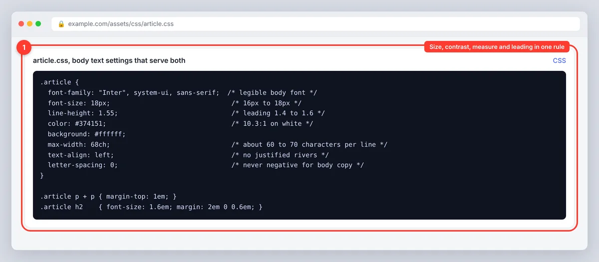
- Pick a legible body font and use it at 16px to 18px with a line height around 1.5. Reserve display fonts for headings.
- Check contrast. Dark grey (not pure black) on white or off-white, 4.5:1 or better.
- Set the measure. Limit text columns to roughly 60 to 70 characters per line (about 600 to 700px for 16px text).
- Cut sentence length. Split anything over 25 words. Aim for an average under 20; shorter lines of thought are easier to follow.
- Replace long vocabulary where a shorter term means the same thing: "use" not "utilize", "help" not "facilitate".
- Add structure. A heading every 200 to 300 words, short paragraphs, bullet lists for parallel points, a summary at the top so people can skim to the target section.
- Avoid justified text, long italics and all caps in body copy; they hurt legibility and reading speed.
- Test on the smallest screen your readers use, then run the text through a readability checker and fix the flagged passages.
Why the distinction matters for SEO and UX
Search engines don't measure your font, and no readability score is a ranking factor. But Google's guidance on helpful, people-first content asks whether a page is easy to use and read, and readers vote with their behaviour: illegible type and unreadable prose both end in a quick exit, and both are cheap to fix. Readability also affects how well a page works in featured snippets and AI summaries, which favour clear statements that answer a question directly. For accessibility, legibility (contrast, size) is a WCAG requirement and readability (plain language) is a recommendation; meeting both widens your audience. Our guide to readability scores goes deeper on the editing side.
Conclusion
Legibility and readability are two different jobs. Legibility is the visual side: a clear serif or sans-serif typeface, a comfortable size, strong contrast and sensible spacing, so readers can distinguish every letter with no effort. Readability is the text and its layout: short sentences, familiar words, clear structure, a comfortable line length and enough line spacing. Fix legibility first, because nothing else matters if readers can't make out the letters, then edit for readability and check the result with a readability checker. Readable type on a well-set page, with text passages written for the reader, is easier to use on desktop, on a phone and in print. Good typographic choices and plain writing improve the reader's ability to follow you, whatever the subject.
Frequently asked questions
What is the difference between legibility and readability?
Legibility is how easily individual letters and word shapes can be recognized; it depends on the typeface, size, contrast and spacing. Readability is how easily the text as a whole can be understood; it depends on sentence length, word choice, structure and layout. Legibility is a prerequisite for readability.
Can text be legible but not readable?
Yes. A clear 16px font with good contrast is legible, but if every line runs to 40 words of jargon in a single unbroken block, the text is hard to read. The reverse is also true: good writing in thin grey 11px type is readable in principle but illegible in practice.
What is readability in simple terms?
How easy a piece of writing is to understand on first reading. Shorter sentences, familiar vocabulary, clear structure and comfortable spacing make text more readable and easier to skim; readability formulas such as Flesch-Kincaid estimate it as a grade level.
Which fonts are most readable?
Fonts don't differ much in readability once they're legible; the setting matters more. Choose a typeface with distinct letterforms and a large x-height, use it at 16px or larger with a 1.5 line height and good contrast, and keep lines to 45 to 75 characters.
How do I check the readability of my text?
Paste it into a readability checker to get a Flesch Reading Ease score and grade level, then shorten the longest passages and replace the hardest terms. A score of 60 or more suits most web audiences.