On this page
To improve readability, put the main point first, use short sentences and everyday words, give each paragraph one idea, and break the page up with clear headings and lists. Then test the result: read it aloud, check it on a phone, and run it through a readability checker.
Clear content gets read, understood and acted on. This article gives writers 15 practical changes, how to measure readability in Microsoft Word and online, and what a good readability score looks like.
Key takeaways
- Readability is how easily a reader can comprehend your text. It depends on words, sentence structure, layout and the reader's reading level.
- The biggest gains come from shorter sentences, plain words, one idea per paragraph and descriptive headings.
- Formatting matters too: font size, line spacing, letter spacing, line length and contrast change how hard a page feels.
- Scores like Flesch Reading Ease help you find dense passages, but your reader decides what "easy" means.
- Fix structure first, then sentences, then words, then grammar, spelling and punctuation.
What is readability, and why does it matter?
Readability measures how easy a text is to read and understand. It's different from legibility, which is how clearly the letters can be seen. A page can be perfectly legible and still hard to read if every sentence runs to 40 words. Both matter, but this guide is about readability: the words, sentences and structure.
Readability has a direct impact on how your content and SEO perform, and a greater one than most writers expect. Readers who understand quickly stay longer, trust the page more and are more likely to take the next step. Engaging writing isn't fancy writing; it's understandable writing. That holds for blog posts, product pages, support articles, newsletters, ebooks, emails, training material and any document people need to act on. For video, subtitles do the same job. Clear writing also helps poor readers, readers with dyslexia, people reading in a second language and anyone reading on a small screen, where every distraction adds up. Better readability means better comprehension.
What makes content readable? Key factors
Several factors determine how easy a text is to read:
- Sentence length and syntax: long, complex sentences force the reader to hold too much in mind; simple sentences convey one idea at a time.
- Vocabulary: long or unfamiliar words and jargon slow reading; everyday words speed it up.
- Structure: headings, short paragraphs and lists help readers scan and find what they need.
- Layout: font, font size, line spacing, character spacing, line length and contrast on different devices.
- The reader: what they already know changes what feels easy, and so does the tone you take with them.
How to improve content readability: 15 edits that work
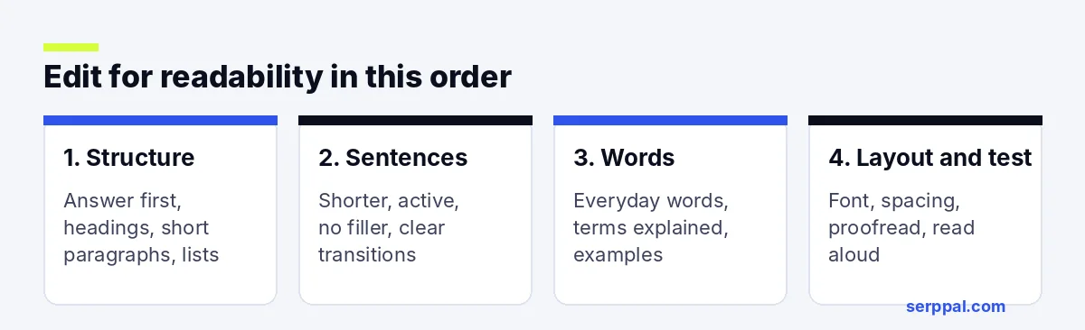
Work through these in order. The first changes fix structure, the middle ones fix sentences and words, and the last ones polish and test.
Structure
- Know your reader. Write down who they are and what they need to do after reading. Every other change follows from this.
- Lead with the answer. Put the main point in the first two sentences. Readers who only skim still get it.
- Use descriptive headings and headlines. Headlines determine whether people keep reading. Add a heading every 200 to 350 words, and make it say something ("How to reset your password", not "Overview").
- Keep paragraphs short. One idea per paragraph, usually two to four sentences. White space makes a page feel easier before anyone reads a word.
- Use lists for steps and options. Numbered lists for sequences, bullets for sets of items.
Sentences
- Shorten complex sentences. Aim for an average of 15 to 20 words, and split most sentences over 25. A sentence of 12 words or fewer is fine for your key points.
- Use active voice. "The team approved the budget" is clearer than "The budget was approved by the team." Passive voice isn't wrong, but too much of it makes readers decipher who did what.
- Cut filler phrases and extra adverbs. "In order to" becomes "to"; "due to the fact that" becomes "because"; "at this point in time" becomes "now". Concise phrases read faster.
- Add transitions. Words like "so", "but", "for example" and "next" show how ideas connect.
Words
- Choose everyday words. "Use" over "utilize", "help" over "facilitate", "start" over "commence".
- Explain technical terms once. If your audience needs a term, define it the first time it appears, then use it consistently.
- Use concrete examples. An example turns an abstract rule into something the reader can picture, which improves reader understanding more than any synonym.
Layout and polish
- Format for screens. Use a body font of at least 16 pixels, line spacing around 1.5, lines of roughly 50 to 75 characters and strong contrast. A clean sans-serif font such as Helvetica or Arial works well on screens; a serif font is fine for long print material.
- Proofread. Spelling errors, grammar slips and messy punctuation make readers stop and reread. Proofreading is the cheapest readability fix there is, and a grammar tool catches most errors.
- Test it. Read the writing aloud, check it on a phone or in a reading app, and run it through a free readability checker to find the sentences to shorten.
Before and after: a readability edit
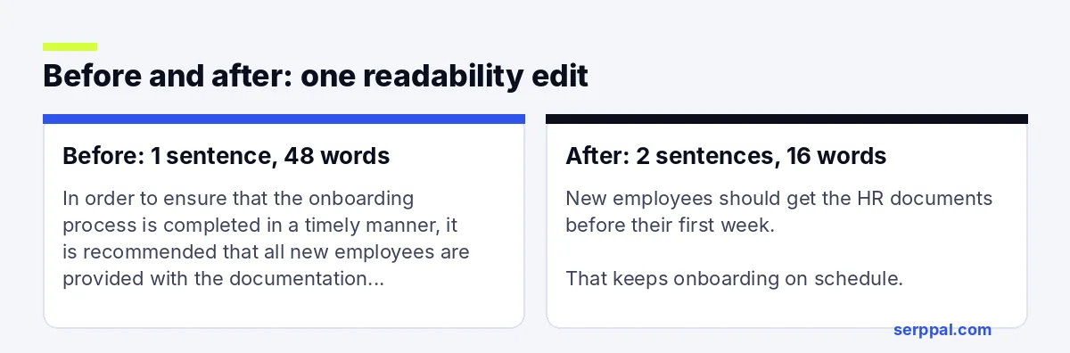
Before (one sentence, 48 words): "In order to ensure that the onboarding process is completed in a timely manner, it is recommended that all new employees are provided with the documentation that has been prepared by the human resources department prior to the commencement of their first week of employment with the company."
After (two sentences, 16 words): "New employees should get the HR documents before their first week. That keeps onboarding on schedule."
The change cuts filler, switches to active voice and splits one long sentence into two short ones. The meaning stays the same, but the reader gets it in one pass.
How to measure readability
Readability formulas analyze sentence length and word length to estimate difficulty. A readability score is a quick check for any article, and it's useful for simplifying the hardest passages first. The two most common:
| Formula | Scale | What a good target looks like |
|---|---|---|
| Flesch Reading Ease | 0 to 100, higher is easier | 60 to 70 for general web content |
| Flesch-Kincaid Grade Level | US school grade | Grade 7 to 9 for a general audience |
Each Flesch formula is a rough guide to reading level. To raise your Flesch Reading Ease (or lower your Flesch-Kincaid grade level), shorten sentences and replace words with many syllables. Simplifying a few of your longest sentences usually moves the score the most. Our guide to readability scores explains each formula and what the numbers mean.
Word document readability: checking in Microsoft Word
Microsoft Word can show readability statistics. Go to File, then Options, then Proofing, and tick "Show readability statistics". After Word checks spelling and grammar, it shows the Flesch Reading Ease and Flesch-Kincaid Grade Level for the document. Google Docs has no built-in readability score, so paste the text into an online tool instead, or use a Google Docs add-on, which means installing it from the Workspace Marketplace.
Is a 42 readability score good?
A readability score of 42 on the Flesch scale is "difficult", roughly college level. That's fine for a technical paper read by specialists, but too hard for most web content or customer emails. If your audience is general, aim higher.
Typography and spacing: the visual side of readable content
Spacing does a lot of quiet work. Tight line spacing makes lines blur together; too much makes the eye lose its place. As a rule of thumb for web text:
- Line spacing: about 1.4 to 1.6 times the font size.
- Paragraph spacing: a clear gap between paragraphs, so each idea stands apart.
- Letter spacing and word spacing: leave the defaults for body text; very tight character spacing hurts reading, and slightly wider spacing helps some readers with dyslexia.
- Line length: 50 to 75 characters per line on desktop; shorter lines are normal on phones.
Research backs up how personal this is: the best readability comes from a typeface and reading format that suit the individual. Adobe Research has studied how different fonts change reading speed for different people, and found that the best font varies from reader to reader. That's one reason good typography leaves room for settings. If you design pages in Adobe InDesign or Adobe Express, you can set leading (line spacing) and tracking (letter spacing) directly. If you build apps, Apple's Human Interface Guidelines recommend supporting Dynamic Type so text scales with the reader's own settings on Apple devices.
Reading app settings and readability features
Readers can also adjust text to suit them, and every major reading app now does this. A reading app, phone app or browser often has readability features built in: Microsoft's Immersive Reader lets people change text size, spacing and background, and read-aloud modes with word highlighting engage more than one of the senses. Apple Books lets readers pick the font and adjust line spacing, character spacing and word spacing, and Apple devices add system-wide text size settings. Adobe Acrobat Reader, the free Adobe app for PDFs, has its own reading options. Adobe Acrobat's Liquid Mode reflows PDFs for phone screens, and Google Chrome has a reading mode that strips clutter from a page. These tools improve the reading experience in any reading app, but they can't fix unclear writing, so the changes above still come first.
Readability and SEO
Google doesn't use a readability score as a ranking factor for SEO, and Google's own guidance focuses on helpful, people-first writing. But clear content tends to perform better because it answers the question quickly, keeps visitors engaged and earns links and shares. Clear headings and direct answers also make it easier for search engines and AI summaries to pick out your main points. When you optimize an article for search, run a readability pass at the end so the keyword work doesn't make the text harder to read. Many SEO plugins add readability hints in WordPress, and a readability score check fits into any SEO writing workflow, and SerpPal's editor shows reading ease in its Insights tab while you write.
Conclusion
Improving readability is mostly about respect for the reader's time, and the solutions are simple. Good writing has more impact on the reading experience than any font choice. Lead with the point, keep sentences short, use plain words, break up the page and test the result. A score can guide you, but the best check is simple: could your target reader understand this in one read? If yes, your writing works.
FAQ
What does readability mean?
Readability is how easy a text is to read and understand. It depends on sentence length, word choice, structure and layout, and on what the reader already knows.
What is a good readability score?
For most web content, a Flesch Reading Ease of 60 to 70 or a Flesch-Kincaid grade level of 7 to 9 works well. Technical audiences can handle lower ease scores; general consumer content often aims higher.
Do you say readable or legible?
Use "readable" when text is easy to understand and "legible" when the letters are easy to see. Handwriting can be legible but hard to follow; a clear text in a tiny font can be readable but not legible.
How can I improve readability quickly?
Split your longest sentences, replace a handful of formal words with everyday ones, and add headings and bullet points. Those three edits usually make the biggest difference in the least time.